When psychology students are taught power, they are often only shown the general concept. You talk about p-values, types of errors, and sample sizes and you work through a simple example with a t-test. Useful tools like G* power are mentioned and maybe even demoed. But, when it comes time to actually apply that concept to a real design with many different variables, doing a power analysis suddenly seems much more complicated. Here I am going to make the case that you should use simulations to calculate power as they are both more flexible and easier to understand. I am going to assume that you at least have a general understanding of the concepts mentioned above, but I will provide a basic recap in case you are a little rusty.
What is Power?
If you recall from your intro statistics class, a p-value is the probability of observing results as or more extreme than your own under the null hypothesis. If this probability is low enough (p < 0.05) we conclude that we were unlikely to observe our results by chance and reject the null. Of course, it is always possible that we are incorrect. Sometimes, even though there is only a 5% chance our data would have come from the null model, we happen to hit that 5% and reject the null when we shouldn’t. This is a type I error or a false positive. Alternatively, there could be a real effect, but we end up with a p-value greater than 0.05 and fail to reject the null. This is a type II error or a false negative.
Our chance of making a type I error is fixed according to the value at which we choose to reject our null, also known as alpha (0.05). However, by increasing our power we do have control over how often we make type II errors! Higher power means fewer failures to reject incorrect nulls. Generally speaking we can increase our power in two ways: decreasing noise and increasing sample size. This is where I assume most people are at in their understanding of power, along with knowledge of a tool that you can use to calculate it. But have you ever calculated power by hand?
A Low Level Example
Let’s look at an example where we compare IQ across two groups, each with a sample size of 10. We will calculate power for a t-test given the following population parameters. The first group has a true mean of 100 with a standard deviation of 15. The second group has a true mean of 112, also with a standard deviation of 15. Below we represent this in R.
g1_n = 10
g1_mean = 100
g1_sd = 15

g2_n = 10
g2_mean = 112
g2_sd = 15
To go from these values to power, we need to calculate a standardized effect size for the difference between g1_mean and g2_mean. This can be calculated with the formula \(ES = (mean_1 - mean_2) / sd_{pooled}\). In this example, we can simply state that the \(sd_{pooled}\) is 15 as both groups have the same observed standard deviation and we have the same number of subjects in each group. With these values, we can now calculate our standardized effect size.
(effect_size = (g2_mean - g1_mean) / 15)## [1] 0.8Let’s pause for a second and recall our goal. We want to determine the probability that we detect an effect given a standardized effect size of 0.8. To do this, we first need to know how t-values are distributed under the null hypothesis. Any guesses? Hopefully you remember that t-values under the null follow the t-distribution (in this case, with a df equal to 18). But have you ever thought about how t-values are distributed under the alternative hypothesis? Is that even something we can determine?
In fact, we do know how t-values are distributed under the alternative hypothesis and it is critical for these calculations. It turns out that under the alternative hypothesis, our t-values are distributed under a generalized form of the t-distribution called the noncentral t-distribution. This generalized t-distribution includes a parameter called the noncentrality parameter that allows the t-distribution to be centered somewhere other than 0. This makes sense because under our alternative hypothesis we are expecting some nonzero effect! Unlike the normal distribution, the t-distribution actually changes shape as a result of this parameter. I’m not going to show the formula to calculate the noncentrality parameter, but rest assured it is straightforward once you have a standardized effect size and sample sizes 1. Instead, let’s plot both of these distributions and take a look at them.
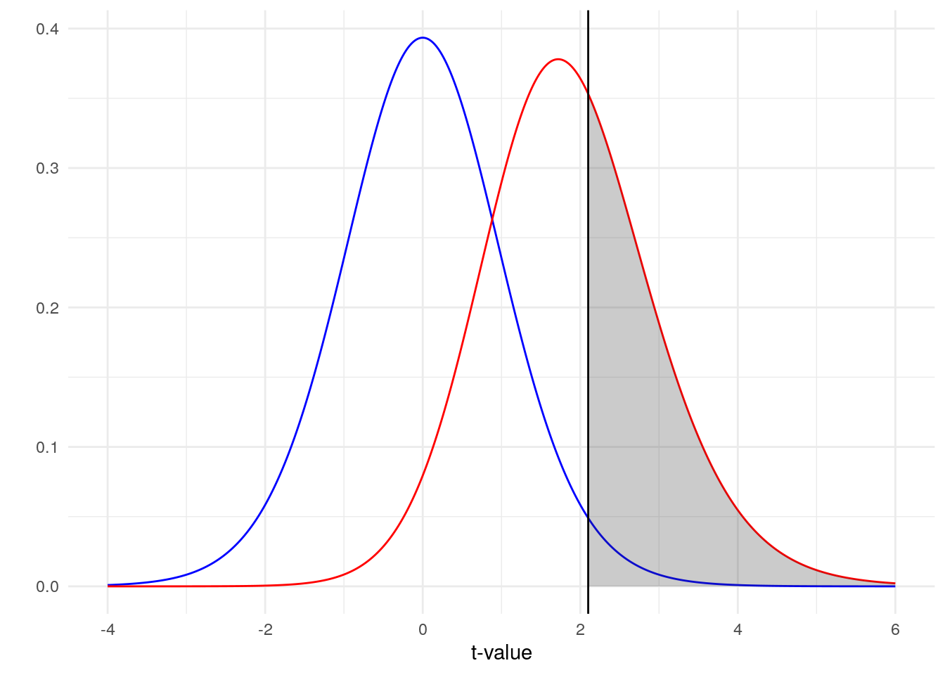
The blue line represents our distribution of t-values under the null hypothesis and our red line represents our distribution of t-values under the alternative hypothesis. Because there is noise, there is some overlap in our two distributions (a larger effect size leads to less overlap). So how do we decide where to draw the line between concluding we have a t-value from the null or the alternative distribution? We draw that line (represented here by the literal black line on the plot) at our critical t-value, the 97.5th percentile of the blue distribution (for a two-tailed test). Right of that line is the 2.5% type I error rate that we are willing to accept in that direction.
What then is the grey area? That is the area under the alternative hypothesis where we correctly reject the null. That area represents our power! Ideally, we would have a lot of the area under the red distribution colored grey. That would mean that, most of the time, a t-value generated under the alternative hypothesis would lead to a proper rejection of the null. Based on this plot alone, what do you think our power is?
As less than half of the red distribution is colored grey, we should expect our power to be a bit less than 50%. In fact, if you calculate the area of the distribution that is colored grey you get a value of 0.395. Luckily, this is the exact value that you get when you do a power calculation using R, G*Power or an online calculator.
Let’s Try Some Simulation
So that’s all well and good, but you don’t really need to know all that to plug some numbers into a calculator, right? The goal here was just to help give some intuition about what is actually going on under the hood. Now that we have a basic idea about what we are actually trying to accomplish, we can try to replicate these results using simulation. Remember, all we really care about is the percent of that red distribution that is grey and all the other math we had to do along the way was simply moving us towards that final goal. Simulation gives us a simple way of estimating the size of that grey area without all the math it took to get there.
The way this simulation is going to work will be fairly straightforward. We will start by creating a function that generates some random data for us with a specific difference between our two groups. We will then run this function many times and generate many possible datasets and perform a t-test on all of them. To get our power, we will calculate the number of tests that resulted in a significant value. If this works, that number will be close to the number we got from our by-hand approach. Let’s start by creating our function.
get_sample_data = function(n1, m1, sd1, n2, m2, sd2) {
  data.frame(
    group1 = rnorm(n1, m1, sd1),
    group2 = rnorm(n2, m2, sd2)
  )
}
Our function get_sample_data will return a dataframe of random data using the population parameters that we defined. Let’s test it.
(test_data = get_sample_data(10, 100, 15, 10, 112, 15))## group1 group2
## 1 120.56438 131.57304
## 2 91.52953 146.29968
## 3 105.44693 91.16709
## 4 109.49294 107.81817
## 5 106.06402 110.00018
## 6 98.40813 121.53926
## 7 122.67283 107.73621
## 8 98.58011 72.15317
## 9 130.27636 75.39300
## 10 99.05929 131.80170Next, we need a function that takes in this data and performs a t-test on it. If that t-test returns a significant p-value, we will return TRUE.
test_sample_data = function(data){
  t.test(data$group1, data$group2)$p.value < 0.05
}

test_sample_data(test_data)
## [1] FALSETo run it many times, we can use the replicate function.
simulation_results = replicate(1e4, test_sample_data(get_sample_data(10, 100, 15, 10, 112, 15)))
head(simulation_results)
## [1] FALSE FALSE FALSE FALSE FALSE TRUENow all we have to do is calculate the proportion of tests that resulted in a significant value.
mean(simulation_results)## [1] 0.3853Pretty close to our hand calculated value, and hopefully a lot easier to wrap your head around! And, now that you have these functions, it is easy to vary the parameters to see how power changes with both n and effect size.
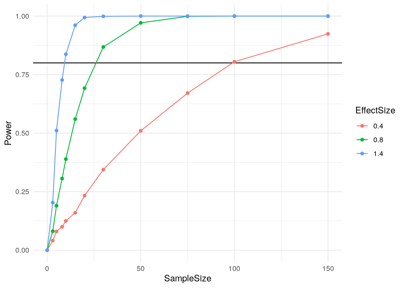
Of course, this is just the beginning. Let’s look at a more complex example where simulation can really shine.
A Real Life Example
For this example, I’m going to do an anova using the palmerpenguins dataset. We will see how the body mass of these penguins vary based upon their species and sex while controlling for flipper length.
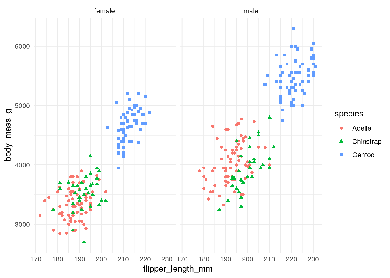
anova(lm(body_mass_g ~ flipper_length_mm + species * sex, data=penguins))## Analysis of Variance Table
##
## Response: body_mass_g
## Df Sum Sq Mean Sq F value Pr(>F)
## flipper_length_mm 1 164047703 164047703 1987.084 < 2.2e-16 ***
## species 2 5368818 2684409 32.516 1.330e-13 ***
## sex 1 17189576 17189576 208.215 < 2.2e-16 ***
## species:sex 2 1739989 869994 10.538 3.675e-05 ***
## Residuals 326 26913579 82557
## ---
## Signif. codes: 0 '***' 0.001 '**' 0.01 '*' 0.05 '.' 0.1 ' ' 1As we can see, we have a number of highly significant effects in our anova. Let’s say that you have access to this dataset and are planning a follow-up study and want to know if you can get away with collecting fewer penguins this time. You are interested in each of the individual coefficients and the interaction between species and sex. How would you go about performing a power analysis to see how many penguins you should collect in your follow-up? My guess is that many psychology students would have trouble in this situation. Even this task can be confusing using tools like G*Power or R’s pwr package. Instead, let’s set up functions that generate random subsets of the data and run our test just like before.
get_penguins = function(n) {
  penguins %>%
    group_by(species, sex) %>%
    sample_n(n)
}

get_penguins(1)
## # A tibble: 6 x 4
## # Groups: species, sex [6]
## body_mass_g flipper_length_mm species sex
## <int> <int> <fct> <fct>
## 1 3150 187 Adelie female
## 2 3500 197 Adelie male
## 3 3650 195 Chinstrap female
## 4 4050 201 Chinstrap male
## 5 4700 210 Gentoo female
## 6 5600 228 Gentoo maleThis time we make sure to have a given number of penguins from each species and sex combination, but other than that this is very similar. Now we can create a function that returns a TRUE or FALSE for each of the coefficients in our anova.
do_anova = function(data) {
  fit = anova(lm(body_mass_g ~ flipper_length_mm + species * sex, data=data))
  (fit$`Pr(>F)` < 0.05)[1:4]
}

do_anova(get_penguins(3))
## [1] TRUE FALSE TRUE FALSEAnd now we can use replicate like before to assess power for any sample size we are interested in.
n_per_group = 5
simulation_results = replicate(1e3, do_anova(get_penguins(n_per_group)))
head(t(simulation_results))
## [,1] [,2] [,3] [,4]
## [1,] TRUE FALSE TRUE TRUE
## [2,] TRUE FALSE FALSE FALSE
## [3,] TRUE TRUE TRUE FALSE
## [4,] TRUE TRUE TRUE TRUE
## [5,] TRUE FALSE TRUE FALSE
## [6,] TRUE TRUE TRUE TRUE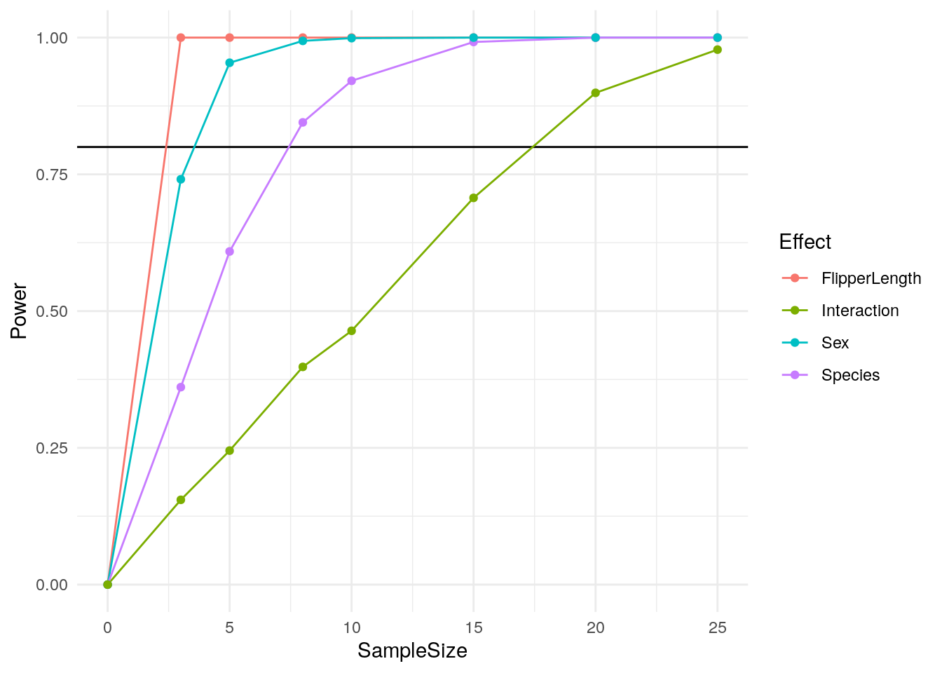
Just like that, we have a clear way of calculating power from our data! But what if you don’t have data to sample from? The cool thing about this approach is that it will work with any data generation process and any statistical test. If you don’t have a dataset to use, you can just generate data randomly with any effects you want like our first example.
Further Reading
Thanks for reading! I hope you found this post interesting. If you did, you might also be interested in these additional resources: